The first season is complete. We need a Cover.
…and I’d like to get your input! That’s one of the fun things about having you here. I have the advantage of more than one brain.
More than one brain - more than one perspective, but lucky for you, only one of us is responsible and accountable if the idea doesn’t work out.
“Oh no, Jaime…that was your idea. I just suggested the change. You never HAD to make it. That’s on you.”
Still worth the risk. So don’t hold back, okay?
Here’s the main idea…
The base of the book cover should have a similar theme, but not the same. Something I can use over and over again, throughout the series. I’ve been thinking about the Dens…and how each of the seven represents a different aspect of the Wild Lands.
Underling Dens:
Crumblers have mountains
Stickies have bugs
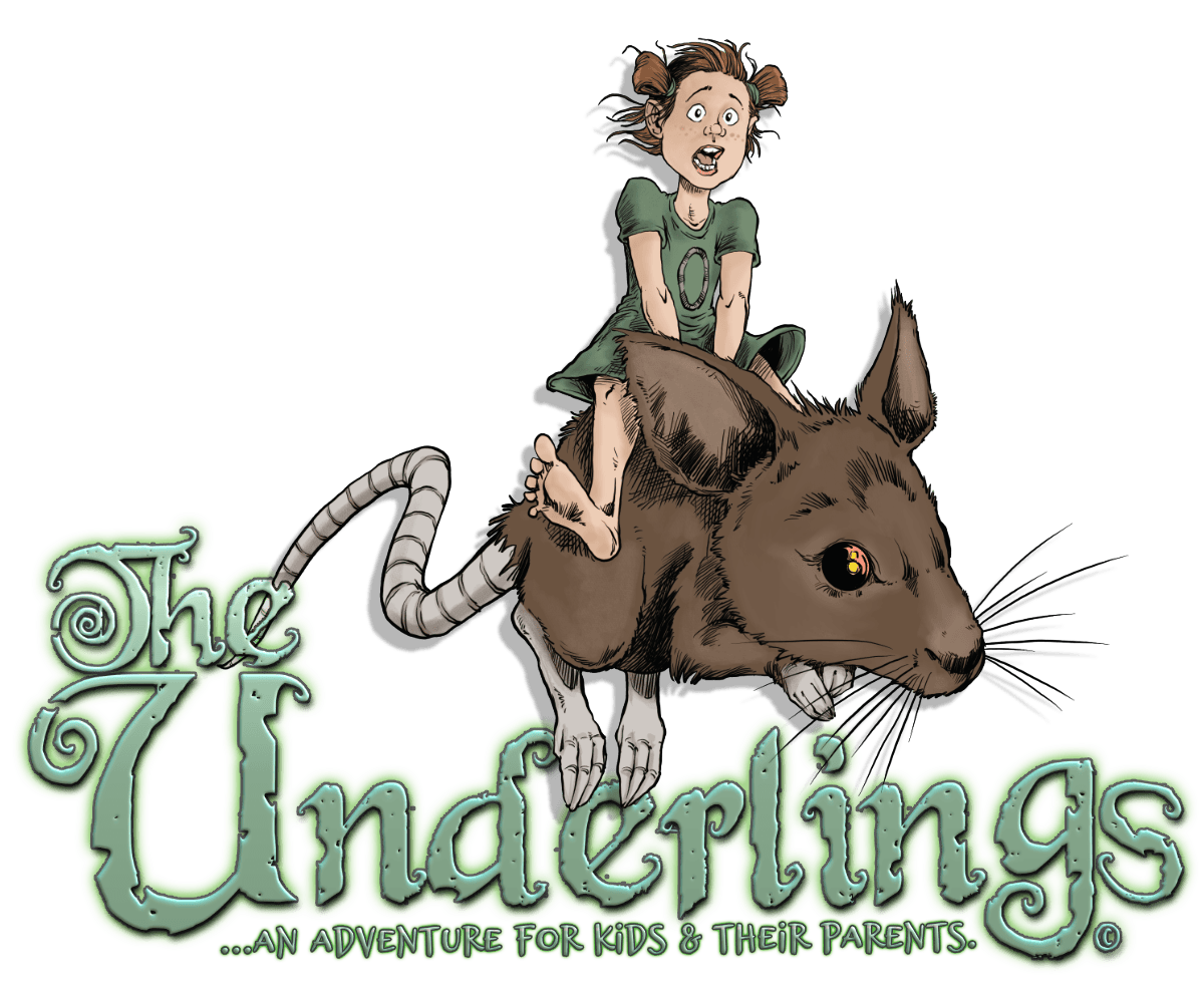
Growlers have a mouse
Droppers have birds
Leafers have a leaf
Skimmers have a boat
and Watchers have an eye
Each of those symbols could be used as a faded design, while the base layer could be an element. This book would involve Crumblers, so I’d try to find a rock/stone texture.
These books will be smaller, early reader type books, so I’m thinking of a 5”x8“ size.

The Cover - Comic Book Style
I know I’ve mentioned this before, but I’ve had many suggest to make the art more realistic, more painted, etc….but that’s just not me. That isn’t my style, and even if that’s not the norm, this (the cover) has to reflect who I am at least to a small degree.
I’m a cartoonist. I make cartoonist projects. I write for kids.


That’s all I have for you today. What do you think?
Any suggestions?
Any comments?
…I’d love to hear them all and discuss your thoughts =)


I love the map, and the symbols make a lot of sense — the book should be in comic book form. It’s not only what you do, it’s how you write, in my opinion. One thing to consider (or not): The drawings currently introducing most of the episodes are adorable and not the least bit scary — for little kids. Is there a way to go somewhere in between your usual polished comic style and the more “silly” look of the sketches. The ape is not too scary in the sketch, for example, but it could use more definition (and color) to conform to your usual style. Either way, I’m sure I’ll pick up a copy when it’s available.
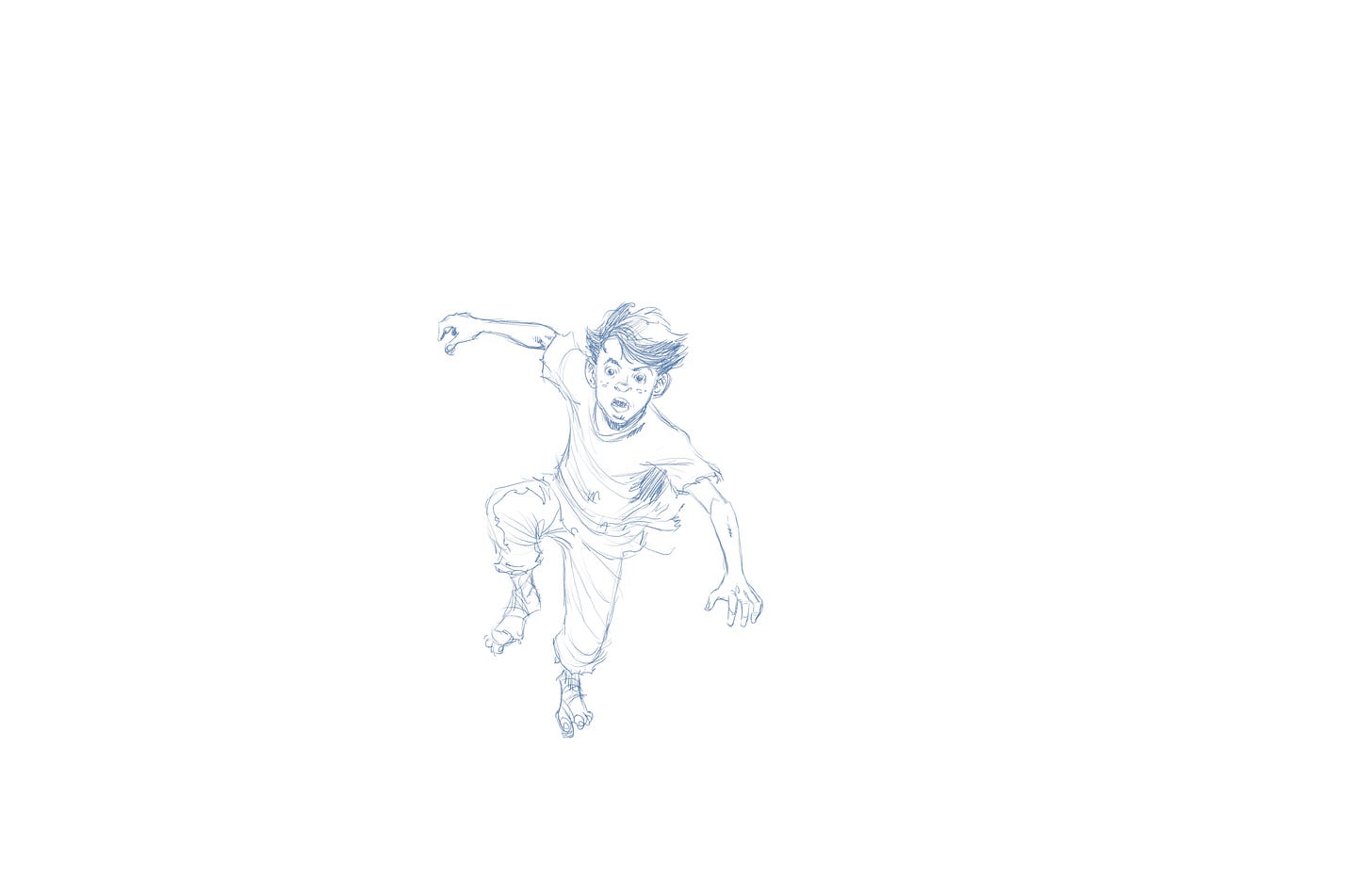
I alove watching concepts and designing in art! Speed drawings sketches and design processes. And that foreshortened hand… very nice.
I only have one gripe (which I think will mostly be fixed when it’s finished) is there is little to go off of for a sense of scale. Without focusing on it for a second you get the impression a boy is getting chased by a giant gorilla (you know a king kong like character). Again I think this will be mostly if not completely fixed once the leaves are added to reference scale… anyway just what was going through my mind.