I have an idea…
So let’s talk about it.
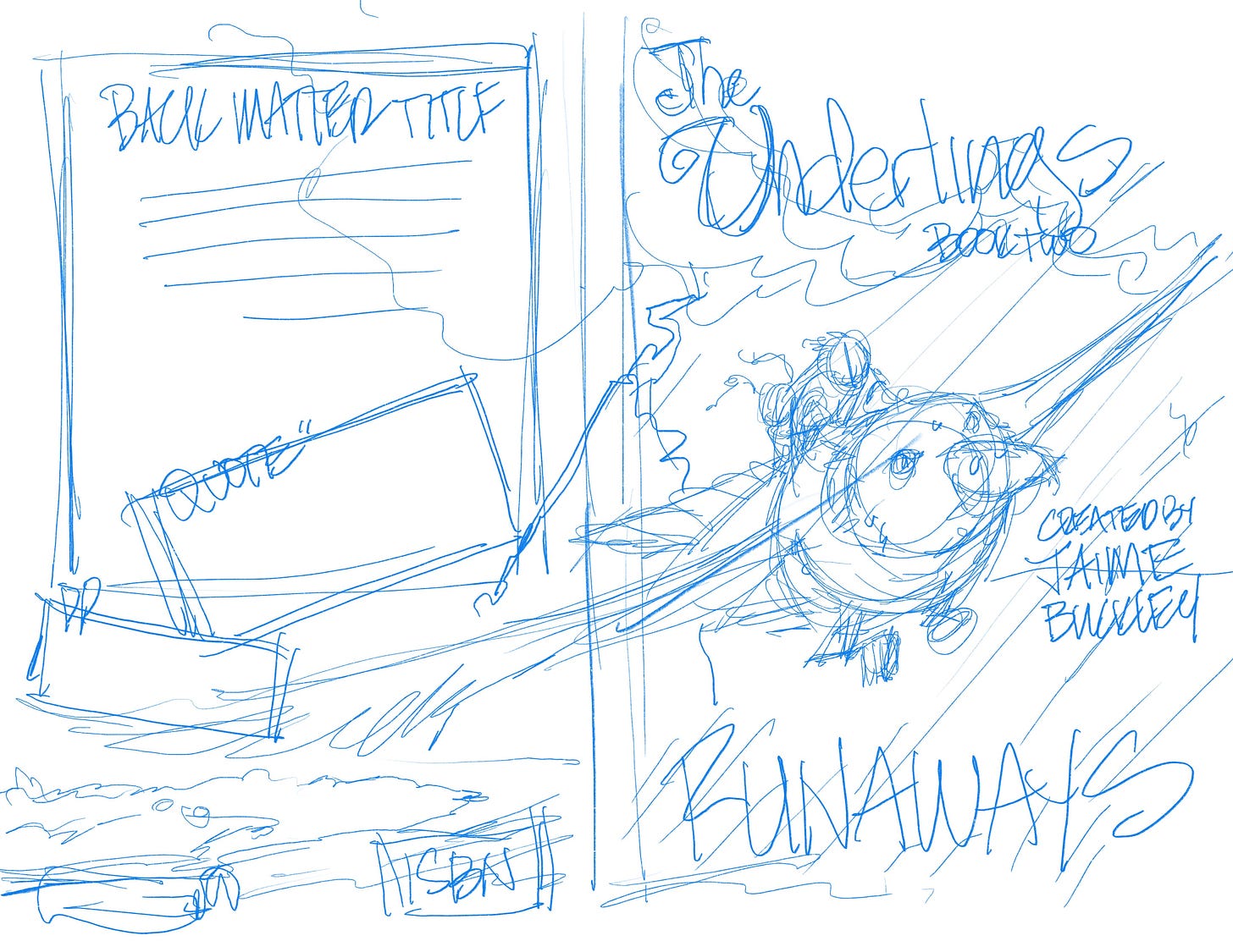
This is the first basic idea I had…and though I was hesitant about it, Deleyna’s comments in the last post convinced me to share this for your thoughts. You give me courage in forming ides, you know why?
Your feedback is always helpful. Always.
Makes me smile, just thinking about that.
To make sure we stay on track, let’s look at the last cover, beCAUSE I want some consistency in this first series. That means some of the cover parts are already decided, mainly;
The title font…you already helped me pick that out, and it’s perfect, so it stays, and;
The paper background…it brings out the ‘cartoon-ISH’ art and provides a kid/youth feel of fantasy that I couldn’t achieve with other textures (tried nearly a dozen last time). So the paper stays as well, with perhaps a few shifts of the watermarks.
Step #2 - Finding what we like by seeing what we DON’T like…and YES, all ideas are welcome!
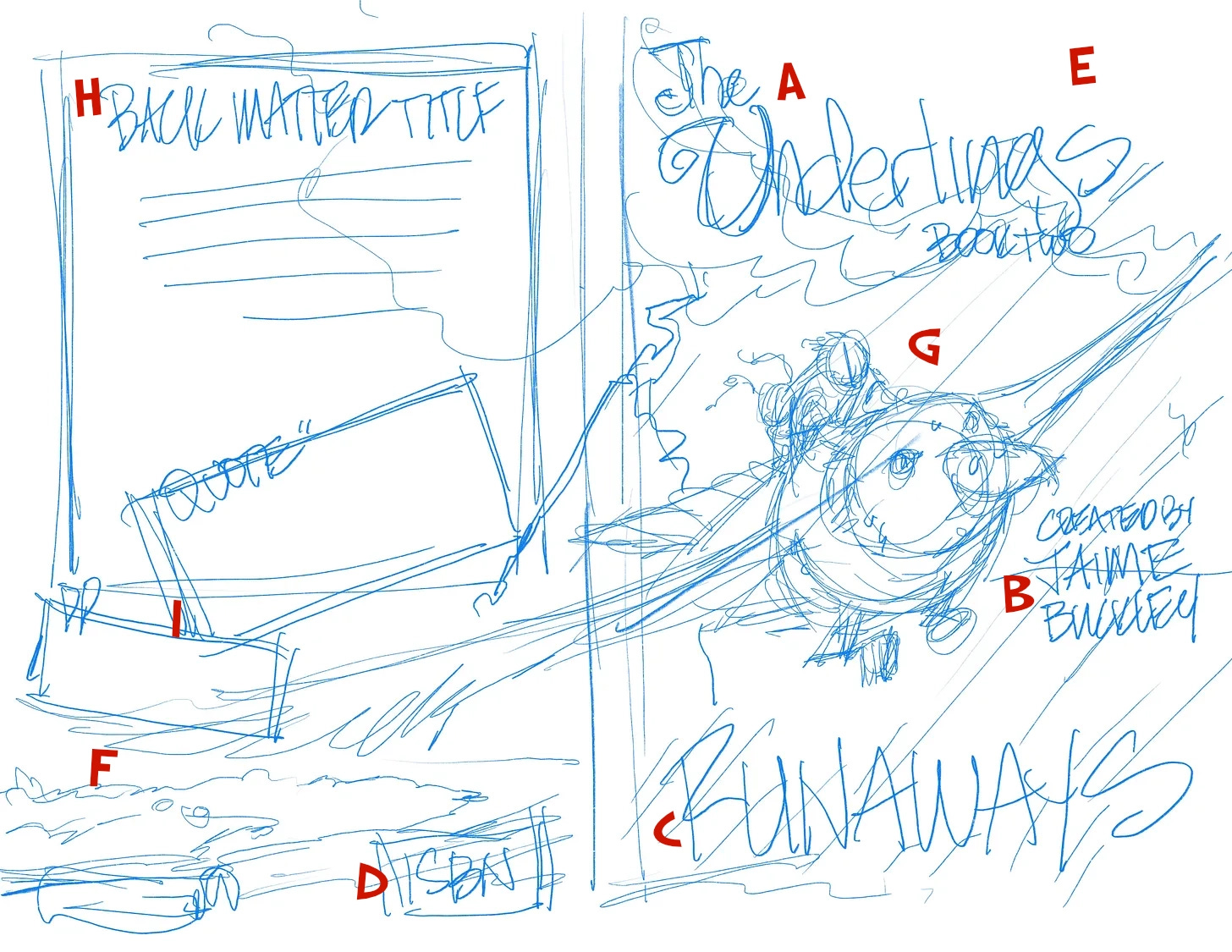
Let’s do a simple breakdown of the cover components. I’ve labeled the sketch so you can follow along.
The biggest problem I had was trying to show the small size of the Underlings. Ro an Ru are having an adventure among another den of their people, in a place where there aren’t many comparisons in size. Not great for a cover.
So I took the last picture from Season 1 and considered that as the cover idea, then mixed it with the elements of Season 2.
Specifically the weather.
Here’s the breakdown of the cover elements we have to be aware of:
A) Title. This will remain the same. The font is perfect. Positioned at the top of the cover, the green will shine against the background.
B) ‘Created by JAIME BUCKLEY’, again, remains the same. Same font, size and likely positioning.
C) Current title, “RUNAWAYS” will be the same font as the series title. This will be centered at the bottom of the front cover.
D) Where the ISBN and barcode will go, along with all the meta/publisher logo, podcast icons and the like. It’ll be the exact same as the first cover.
E) This is the new fun. Storm clouds. Black, looming, filled with energy, power and shooting lightening. This, I believe, can show the danger ahead, because Ro and Ru are flying INTO the storm.
F) The Wild Lands….what they are leaving behind, to confront/face the unknown.
G) Ro, Ru & Nopeus….this s the very center of the scene. I am thinking of a look of determination on Nopeus’s face, with the children hanging on for dear life. Faces turned from the wind and rain, Ru hanging on desperately to her big brother…
I like the wings stretched out across the full cover, because that helps show the size difference with the Underlings.H) The back matter. There will be an eye-catching blurb, then a short synopsis to get the readers interest and hopefully perk their interest.
I) QUOTES! This will be new, and something I hope YOU will participate in. I am looking for quotes from a parent OR a child, that i can put on here, with a first name and age. If an adult, maybe with a quote of your experience with your child(ren), then allow me to put your name and something like ‘Kristie Alers, mom of 2’??
I’d like to get at least 2 quotes, one from a child, if possible.
There you go. That’s what we have so far and I’m awaiting your feedback, views, thoughts, inspirations, and yes,….even your criticisms.
Throw your wildest, most brilliant ideas into the mix! Every thought matters.💡🔥
Let’s hear it—your feeback starts NOW. 💬✨
Author Notes
Please, do NOT HOLD BACK….I’m counting on you for creative feedback, creativity sparks because you have proven THIS community can provide it!!
You’re awesome =)
Jaime


I like the bird size difference clearly communicated!
I’m not sure howl you’ll make the bird look determined… but I leave that up to your genius
I know some people don’t care about color theory… but it works… so I’m curious what kind of colors are you going to try, those will be a subconscious thing that help people grasp the feel of the book
Darker tones for going into danger (I would aim to keep them a bit more desaturated to match the colors of the first book)
Red is often seen as a symbol for rebellion so that’s something to consider
If the storm is a big part of it maybe have a much cooler tone help with that feeling of cold, wet and also dangerous
You could even play around with the lightning colors (blue lighting and yellow lighting for example are both commonly used and give of different vibes)
And if it’s just for vibes who knows maybe you want to be outgoing and say you know what I want my storm to have a purple hue with purple lighting
I’ve seen people take really rough sketches like this and just drop in really rough colors no detail, just colors, it helps you get the vibe and communication across before you commit. It also helps you see where the focus will be drawn because colors dramatically affect that
Also it helps with composition… color theory is just kind of Awesome I only know some of the very basics but its helped me
I don't have any useful comments other than: perfect. Just do the thing.